Field Notes
TOKKI
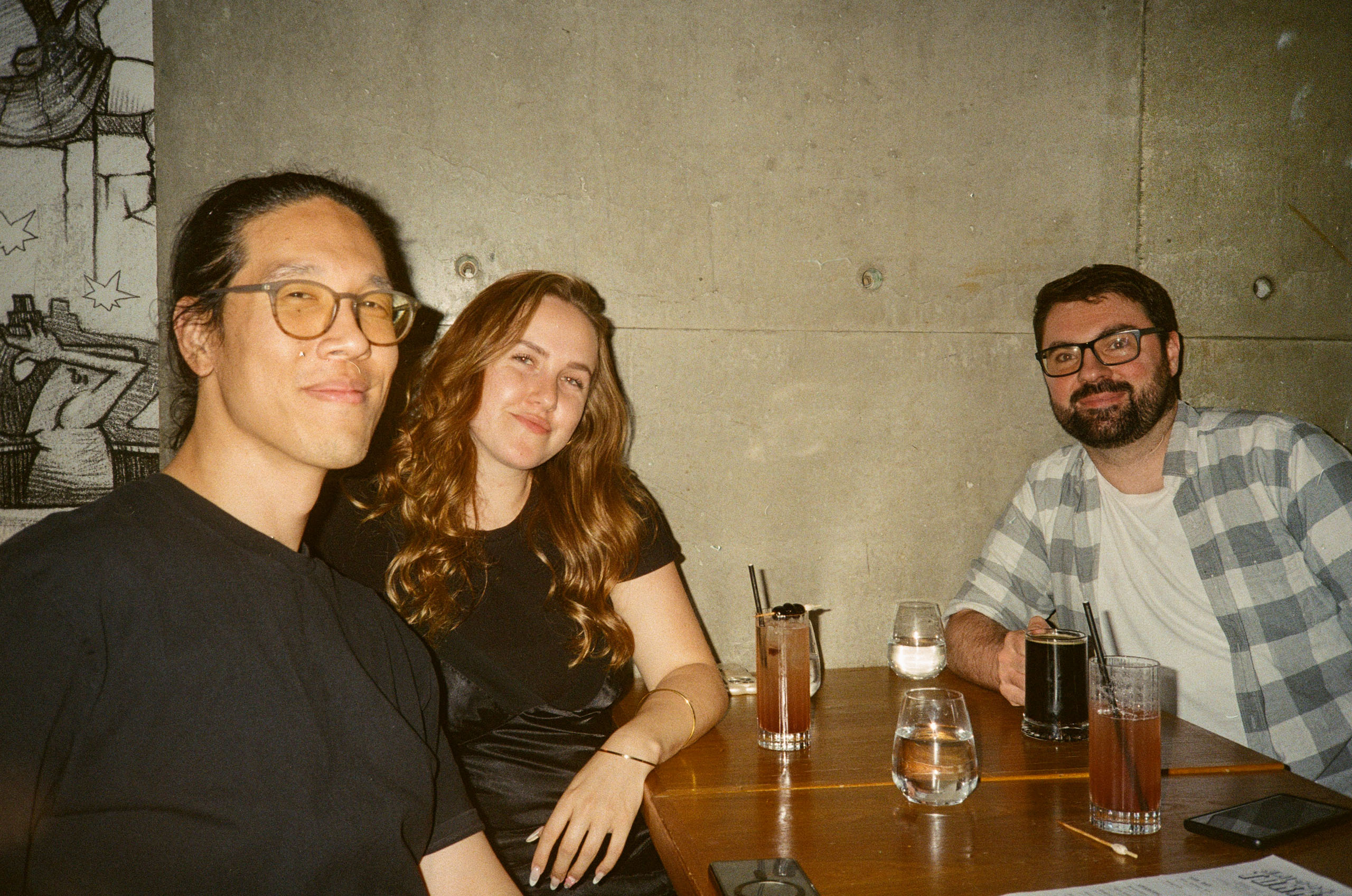
As we continue to drive our team to actively engage with the local hospitality scene, delving into new venues and designs firsthand, Emma, Colin and Sonny visited TOKKI, a modern Korean-inspired restaurant, to experience its food, service, branding, and design. While the atmosphere was fun and inviting, opinions were mixed on whether the menu truly delivered on the brand’s modern promise. Here’s what they had to say:
FOOD
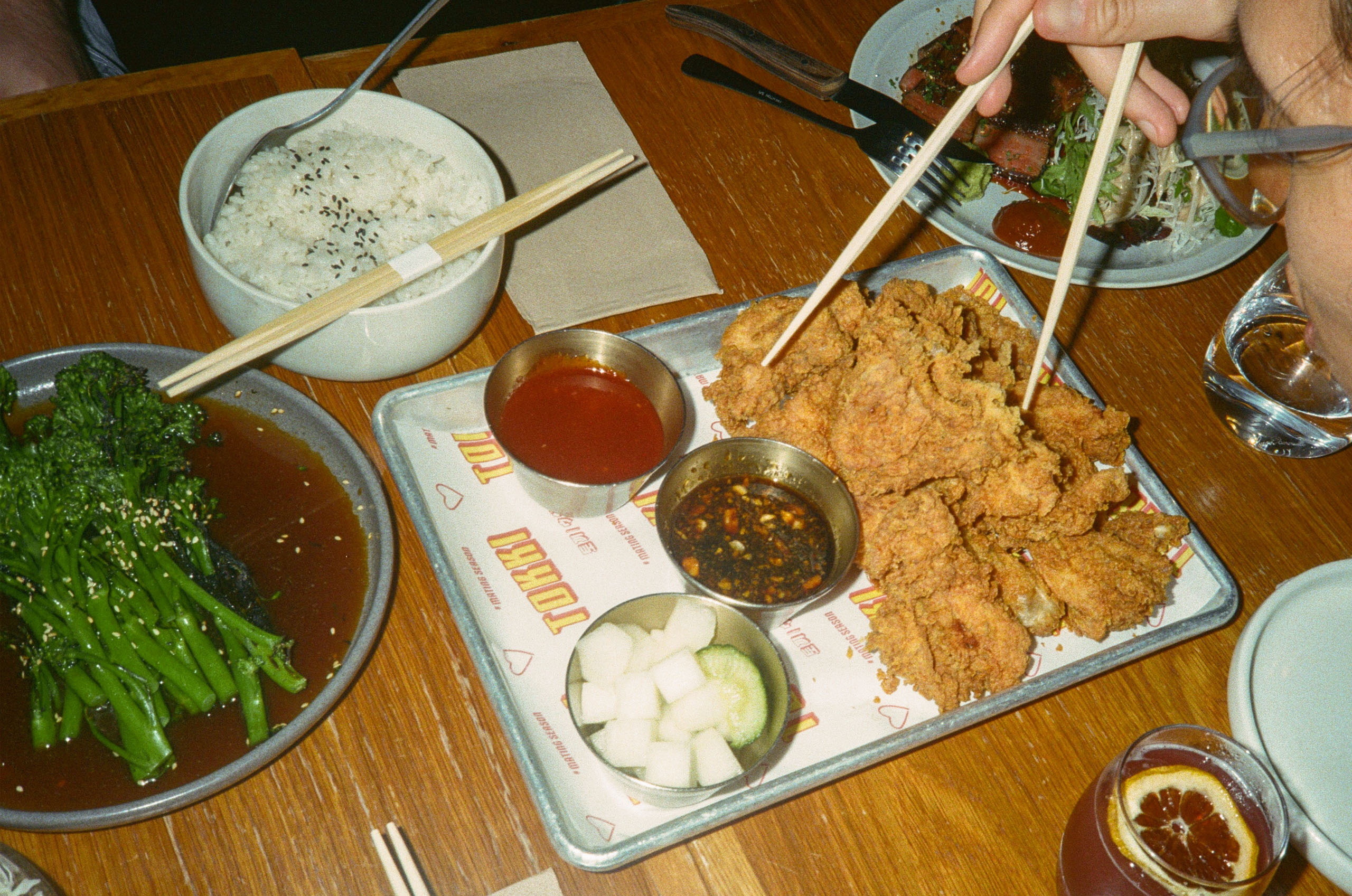
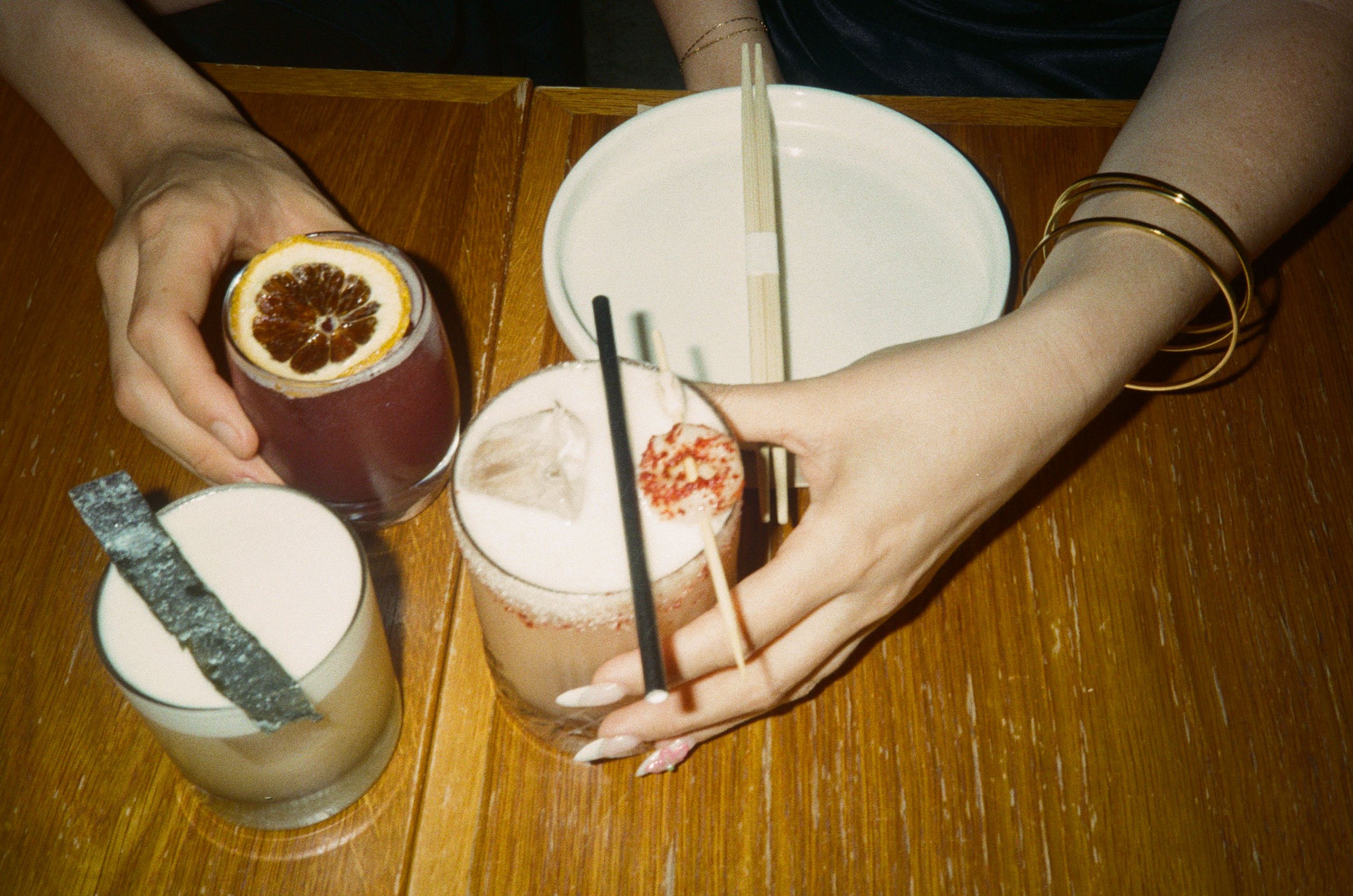
Sonny: Many dishes relied on the same sauces, which became repetitive. The branding suggested a modern take on Korean cuisine, but the menu stayed quite traditional. The beverage selection was modern but lacked standout choices, making the overall experience feel a bit generic.
Emma: The cocktails were fantastic and cleverly named. While the flavours were solid, I expected more of a modern twist. A bit more variety in sauces would have been great. The wagyu beef was the highlight—one of the best I’ve had this year.
Colin: The menu focused heavily on meat and BBQ, with limited vegetarian or vegan options. The wagyu and pork belly were excellent, but the chicken was a little bland. Cocktails were creative and well-branded, but desserts were either unavailable or not offered.


SERVICE
Sonny: Friendly and generally attentive, though our table location made it hard to get noticed at times.
Emma: Warm welcome at the start, but being seated in a back corner left us feeling a bit forgotten. They checked in about the food but didn’t follow up for additional drinks or dessert.
Colin: Service was friendly and efficient at first, but after the food arrived, we were overlooked. Drinks and dessert follow-ups were missing, which felt like a missed opportunity.
BRANDING
Sonny: The restaurant’s branding suggested a contemporary twist on Korean cuisine, but the menu didn’t quite follow through. A stronger focus on uniquely Korean elements would have been more fitting.
Emma: The branding was fun and vibrant, which matched the atmosphere well.
Colin: The contrast of the black-and-white graphic novel-style logo with neon pink accents was a great touch. The branding felt well-integrated with the venue’s energy and menu.
DESIGN
Sonny: The bar felt too open and oversized for the number of guests it served. The back bar was striking and well-placed, but certain decorative elements, like floral signage, felt out of sync with the overall design.
Emma: Visually, there was a lot happening, but it worked within the restaurant’s lively theme. However, our seating placement made it difficult to get proper service.
Colin: The space had a bright and vibrant feel, though some exposed services and bar details felt unfinished. Large windows created great street presence, and seating was well-spaced—close enough for atmosphere but not overcrowded.
OVERALL
Sonny: A solid Korean dining experience in a modern setting. The food and drinks didn’t fully align with the branding, which was a bit distracting, but the flavours were generally good. The wagyu and plum sour were standout highlights. Would love to see a more experimental, modern take on the cuisine to match the restaurant’s identity.
Emma: A really enjoyable meal, but the menu could benefit from a more modernized approach to better reflect its branding. Limited vegetarian options were a downside. The fit-out was fun, and the overall atmosphere was great.
Colin: A lively, inviting venue with a friendly, communal feel. The food was satisfying and generous, but some rough edges in the design and service left room for improvement.


